Showing posts with label illustration. Show all posts

Saturday, 11 May 2013

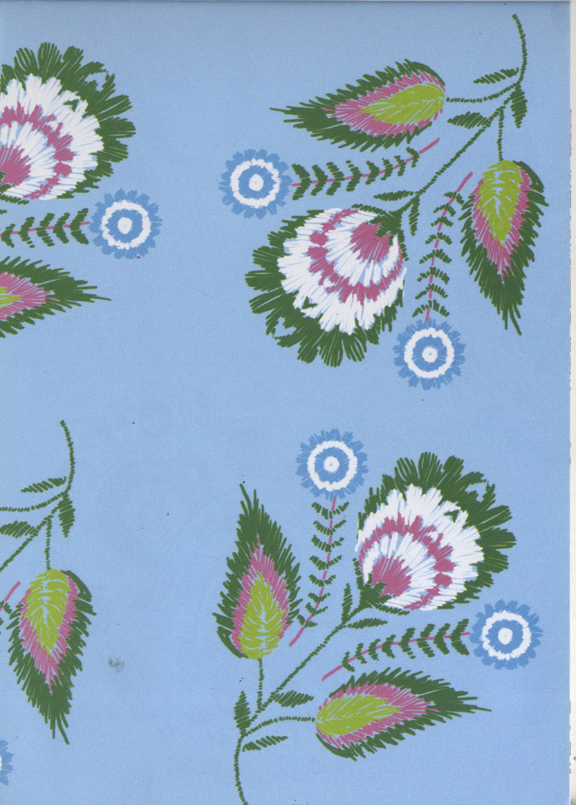
1973 Reclaimed wrapping paper notebook

Went charity shop shopping today to have a break from work and discovered this wonderful notebook in oxfam. Design company 1973 have made a collection for them which uses reclaimed paper to create notebooks and sketchbooks. 

The one I bought was made from reclaimed wrapping paper, I didn't even want a notebook I just fell in love with all of the patterns on the backs of each page!

These are definitely worth checking out if you have an oxfam in your area as they are all currently half price and you get a whole load of beautiful pieces of artwork for not a lot of money (this one was £2.90) If my desk wasn't already a state I would use them to decorate my walls :)




So beautiful!


Monday, 18 March 2013

24 hour comic

Last Friday I took part in a 24 hour comic to raise money for Comic Relief and my end of year show in London. Idea was that we would sit in the University library for 24 hours and aim to complete a 24 page comic.

My sister was visiting so my personal aim was to do 8 hours, leave to meet my sister, go out, then come back at 2am to do another 8 hours, oh and finish 24 pages in 2/3 of the time! Since I have never drawn a comic before I knew this would be interesting...


It started well, we all cracked on and started to get so, decent work done, above is my first page.

Above are my characters entering a fantasy land in between earth and the underworld! I wanted to use the ghost and girl from the book I did before Christmas because I never finished giving them a story! This is the last bit I did before going out and drinking, at this point I had 14 pages! I came back to the library looking like this :p

Library was pretty much empty other than us! And there was a lovely drawing in the notebook i left. It all got a little silly at this point because we were overtired, I was sobering up, and everyone's brains were scrambled... There were a lot of times where we were in hysterics for no reason whatsoever and at one point I did a motivation dance!

My characters went to fight some "Evol Spiritz" and my friend George who does medicine got a cameo:

By around 6-7 we were all slowly dragging out our last drawings, it was a fairly painful experience trying to beat the clock whilst trying to stay awake! I was done by 8.30 which meant I could watch Green Wing with my eyes mostly shut. More shots of the comics will appear on our tumblr soon-www.24hour-comic.tumblr.com and I will be printing some up to sell soon :)


Saturday, 16 February 2013

Pinterest picks this week :)

Have been asked to do another one of these so I figured I would procrastinate a little more...

This week we had an arts showcase where there were guest lecturers from all sorts of backgrounds. We had Clare Owen and Rob Hodgson come in and talk about their work which was awesome! Its so nice being able to talk to working illustrators about what they are doing!


Clare Owen


Rob Hodgson


Henk Wyniger


Vintage circus pictures


Umbrella tree!


Lily Cole by Tim Walker 
(if you ever have a spare £60 I suggest buying his book "pictures" 
it is so worth it I could look at it for hours!)


Scotch Tape series by Wes Naman


whitefauxtaxidermy.com


Beautiful Blythe doll portraits by Shannon_Taylor on flickr


Natural Rock pools in Turkey-I remember going here when I was very little! 


Nick Meek "Welcome to Yosemite"


Stephen Emerson "Shadow People"


Lots of photos this week! Might start doing themes for this :)


Monday, 11 February 2013

Pinterest is amazing!

So if anyone hasn't yet discovered pinterest, this is me recommending how wonderful it is! I find as an art student, you spend a lot of time collecting folders of images to be printed and stuck into books, it is a fairly lengthy process, and does make you wonder if you are doing a degree in cutting and sticking...

I now use Pinterest to collect together groups of images for various purposes, for ideas, mood boards, favourite artists, things to make etc. And as it saves a description, and links back to the original images, you don't have to wonder where it came from, very useful when you are one of those people who would save files and forget which artist the image was by, always helpful during artist research

You can see mine over here

Here are some lovely things I have pinned. 


Illustration by Rob Hodgson


Degas sculpture (which I saw in person at the MET-beautiful!)


Illustration by Julian Callos


Advice To Sink In Slowly poster-Ingunn Dybendal


Paper art by Fideli Sundqvist


Book Cut-Francesca Lowe


Kumi Yamashita shadow art


Jon Toogood tattoo design, Jon is my cousin who works in London, this is the first drawing I saw that made me consider getting a tattoo, until then I had never seen anything I would consider putting on my body! 


Luke Pearson 
Jon Carling


Jay Cover


May do another of these next week, there are too many nice images for me to choose from!


Thursday, 15 November 2012

Why do we perceive things to be disturbing?

Ok so this is fairly random, but I have been doing some research as part of one of my projects and I found the results pretty interesting so thought I would share them :)

I am looking into how we perceive things to be disturbing or creepy, and how illustration can make things appear less shocking, and make subjects like death and violence easier to look at. 

I asked a group of people on my course to look at 5 images and rank them in the order of which made them the most uncomfortable, I then asked them to comment on why they found each image the most or least uncomfortable to look at! 

Here are the pictures in the order of least to most hard to look at, and some people comments. Feel free to comment and let me know what order you would have put them in, and why :)

(Illustration by Joanne Oldham)

“The character being stabbed doesn't look like they're in pain.. and it's a puppet, and a cartoon..”
“far away from reality. The colours are less intimidating/scary and the figures have no obvious expressions so it’s easier to distance yourself from what’s happening"
“the characters are too naively drawn, colours are whimsical (all 3 prime colours are used too, a device often used in childrens toys to make them more appealing) the witch is not looking at her victim, which detracts from the hostility the picture would otherwise have”

(from the gashlycrumb tines by Edward Gorey)

“more subversive almost Burton-esque horror”
“This one is really sinister when you think about it, but doesn't feel that disturbing to look at as an image”

“weird but its cartoon like so not as harsh as the more realistic ones.”

“is easy to look at because of the black and white and the snow. it reminds me of calvin and hobbes which i like to read.”


(from tumblr, if you know the artist please comment)

“not as realistic and sort of cute in a twisted way, but it’s a dead kid and that’s not nice, the colours are pretty morbid”
“The way the body is hanging and the sickly colours - It's looks like an old Victorian photograph, which is creepy..”
“cos its a child and it stands out from the others due to yellow colour”

(also tumblr, comment if you know the artist)

“It's the eyes...! She's looking right at you...! And I think the contrast in colours makes it the most intense and disturbing image”
“crazy eyes and depth of blood colour”
“because the eyes are staring directly at you”

(also tumblr, comment if you know the artist)

“claustrophobic images and graphic”
“feeling of claustrophobia and torment”
“very disturbing but the lack of colour causes me to mostly view it objectively rather than subjectively”
“realistic so easier to relate to and looks disturbing-not too bad cos’ there’s no blood”


In conclusion, this confirmed some of what I expected. We are more shocked by images that are more human and things that we can relate to. When things are more cartoon-like they seem detached from reality and therefore less shocking, even if the imagery is of dead children. Many found the fourth image most disturbing because the eyes were looking directly at you, the last image won out because of the feeling of claustraphobia and the fact that it was the most realistic.

One thing I hadn't thought about was how colour affected peoples perceptions, the first image uses bright primary colours which makes it more playful and the imagery was very simplistic, the blood made up of cartoon style droplets means it is very detached from reality.
In the other images, the sickly yellow in the image of the child made it more disturbing, and a few commented that the two monochrome images were easier to look at because of the lack of blood and colour. The face covered in blood was close to winning because people found the blood and colours gross and intense to look at.  

So, what do you think of this experiment? Some useful things to work with here if you want to make any artwork of dead people :)